
Understanding the Artistry of LEO’s Letter Logo Designs

LEO, a brand designer known for his innovative letter logo designs, has captured the attention of many with his clever and creative approach to typography. His work on BEHANCE showcases a unique talent for transforming simple letters into brand identifiers that resonate with the essence of the brand they represent.
The Evolution of LEO’s Letter Logos
LEO’s letter logo designs are a testament to his ability to think outside the box. By subtly altering the shape of letters or combining them with other elements, he creates logos that are not only visually appealing but also highly memorable. Let’s delve into some of his most notable creations.
| Letter | Logo Concept | Brand |
|---|---|---|
| A | AirBalloon | AirBalloon |
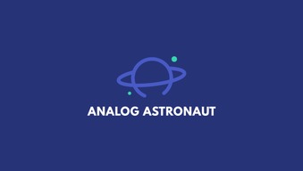
| A | Planet Saturn | ANALOG ASTRONAUT |
| A | Secret Agent Hat | Secret Agent |
| A | Dumbbell | GYM BRAND |
| B | Pin Point | Small Parts Manufacturer |
| C | Collector’s Magnet and Coin | Collector |
One of LEO’s most striking designs is the letter ‘A’ transformed into an air balloon, complete with a small square at the bottom to represent the basket. This logo for an air balloon company is simple yet effective, capturing the essence of the brand in a single image.
Another creative take on the letter ‘A’ is LEO’s design for ANALOG ASTRONAUT, where the middle horizontal line of the letter is replaced with a circle, creating the image of a planet. This clever logo perfectly encapsulates the brand’s identity as an analog astronaut.
For a secret agent brand, LEO designed the letter ‘A’ with the bottom part replaced by a hat, instantly transforming it into a logo that evokes the image of a secret agent. The simplicity and cleverness of this design make it highly effective.
LEO’s letter logo designs are not limited to single letters. He has also combined letters to create unique and memorable logos. For example, the letter ‘C’ combined with the letter ‘O’ forms the word ‘Collector,’ which is a perfect fit for a brand that specializes in collecting.
LEO’s Design Philosophy

LEO’s design philosophy is centered around the idea that a logo should be more than just a visual representation of a brand. It should tell a story, evoke emotions, and create a connection with the audience. His letter logo designs are a perfect example of this philosophy in action.
By focusing on the letter elements, LEO is able to create logos that are both unique and highly relevant to the brand they represent. His ability to transform simple letters into powerful symbols is what sets his work apart from others.
The Impact of LEO’s Letter Logos
LEO’s letter logo designs have had a significant impact on the world of branding. His innovative approach to typography has inspired many designers to think creatively about their own work. His logos are not only visually stunning but also highly effective in conveying the brand’s message and values.
Whether it’s for a small business or a large corporation, LEO’s letter logo designs have proven to be a powerful tool in the branding process. His ability to create logos that stand out and resonate with the audience is what makes him a sought-after designer in the industry.
In conclusion, LEO’s letter logo designs are a testament to his creative genius and his ability to think outside the box. His work is a perfect blend of art and functionality, and his logos are sure to leave a lasting impression on anyone who sees them.


